Chapter 17: Image Galleries & Wrapping Layouts
A common challenge in web design is creating a gallery of items (like photos or product cards) that look great regardless of how many items there are or how wide the screen is. This chapter focuses on creating robust, auto-wrapping layouts using Flexbox and CSS Grid, illustrated with beautiful specimens from nature.
1. The Auto-Wrapping Flexbox Gallery
Flexbox is perfect for galleries where you want items to flow like words in a paragraph—filling one row and then wrapping to the next. By using flex-grow, you can ensure that items stretch to fill any remaining space at the end of a row, avoiding awkward gaps.
.flex-gallery {
  display: flex;
  flex-wrap: wrap; /* Allows items to flow to the next line */
  gap: 1rem;
}

.gallery-item {
  flex: 1 1 200px; /* Grow to fill space, start at 200px */
  aspect-ratio: 1 / 1;
  object-fit: cover;
  border-radius: 12px;
  border: 1px solid #e2e8f0;
}
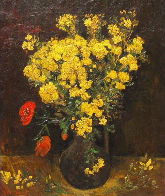
Example: Flower Collection

2. The Power of auto-fit and auto-fill in Grid
CSS Grid provides a more precise way to create "responsive without media queries" layouts. By using the repeat() function with minmax(), you can define a minimum width for your items and let the browser decide how many columns to create.
auto-fit: Collapses empty tracks and stretches the filled tracks to occupy the remaining space. This is best for centering a small number of items.auto-fill: Preserves the empty tracks as slots, even if they contain no items.
.grid-gallery {
  display: grid;
  /* At least 250px wide, sharing the remaining space (1fr) */
  grid-template-columns: repeat(auto-fit, minmax(250px, 1fr));
  gap: 1.5rem;
}
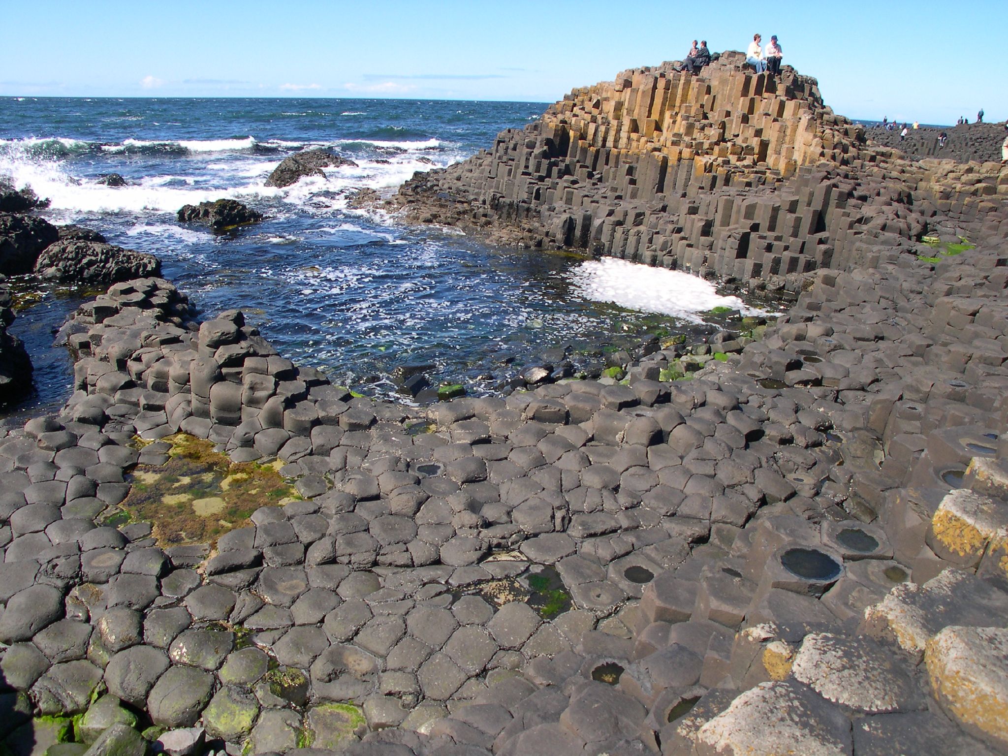
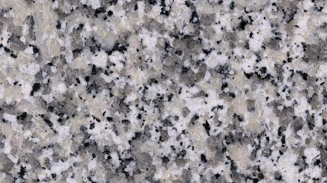
Example: Geological Samples (auto-fit)

Grand Canyon Strata
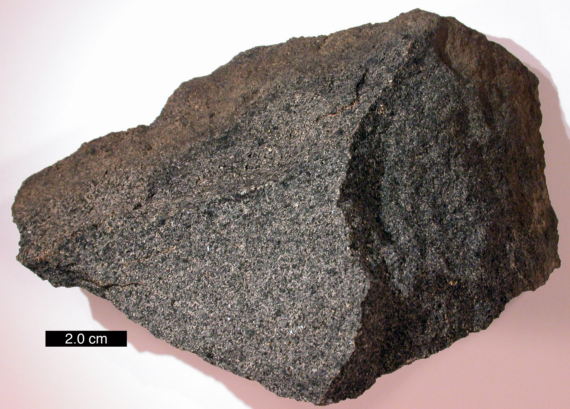
Magmatic Gabbro

River Pebbles
3. The "Featured" Grid Layout (Mosaic)
Sometimes you want one item to stand out—perhaps a "hero" image that spans two columns and two rows. CSS Grid makes this trivial using grid-column and grid-row.
.featured-grid {
  display: grid;
  grid-template-columns: repeat(auto-fit, minmax(150px, 1fr));
  grid-auto-rows: 150px;
  gap: 1rem;
}

.featured-item {
  grid-column: span 2;
  grid-row: span 2;
}
Example: Nature Spotlight


4. Hover Overlay: Interactive Galleries
A professional-looking gallery often hides text or icons until the user hovers over an image. This is achieved by overlaying an absolutely positioned element inside a container with overflow: hidden.
.overlay-container {
  position: relative;
  overflow: hidden;
}

.overlay-text {
  position: absolute;
  bottom: -100%; /* Hidden by default */
  left: 0;
  width: 100%;
  padding: 1rem;
  background: rgba(0,0,0,0.6);
  color: #fff;
  transition: bottom 0.3s ease;
}

.overlay-container:hover .overlay-text {
  bottom: 0; /* Slide up on hover */
}
Example: Wildflower Labels


5. Scroll-Snap: Touch-Friendly Horizontal Galleries
For mobile users or high-impact hero sections, you might want a horizontal "slider" gallery. The scroll-snap properties ensure that the scroll position locks perfectly onto each image, creating a polished, native app feel.
.snap-gallery {
  display: flex;
  overflow-x: auto;
  scroll-snap-type: x mandatory; /* Snap on horizontal axis */
  gap: 1.5rem;
  padding: 1rem;
  scrollbar-width: none; /* Optional: hide scrollbar */
}

.snap-item {
  flex: 0 0 85%; /* Show 85% of item, hinting at the next one */
  scroll-snap-align: center; /* Lock to center */
}

.snap-item img {
  width: 100%;
  aspect-ratio: 16 / 9;
  object-fit: cover;
  border-radius: 16px;
}
Mobile Preview (Logic)
6. Masonry-Style (Pinterest) Layouts
A "Masonry" layout is one where items of different heights are tucked into each other to minimize gaps. While a perfect masonry layout traditionally required complex JavaScript, CSS Columns offer a simple alternative for vertical flow.
.masonry-gallery {
  columns: 3 200px; /* 3 columns, minimum 200px wide */
  column-gap: 1rem;
}

.masonry-item {
  break-inside: avoid; /* Prevents an item from being split across columns */
  margin-bottom: 1rem;
}

.masonry-item img {
  width: 100%;
  border-radius: 8px;
}
Mixed Nature Gallery


7. Debugging Checklist
- Items Squashed? Ensure
object-fit: coveris on theimgtag, not just the container. - Horizontal Scrollbars? Check if a child item has a fixed
widthlarger than the screen. - Empty Gaps? In Grid, try switching from
auto-filltoauto-fitto stretch items. - Snap Not Working? Ensure the parent has
overflow-x: autoandscroll-snap-typeset. - Masonry Items Cutting? Don't forget
break-inside: avoidon the column items.
Summary: By combining Flexbox, Grid, and modern properties like object-fit and scroll-snap, you can build galleries that feel like professional applications while remaining lightweight and fast.